Neighbourhood · Website 2026 · v2
Design for the humans on the tools.
The living design system for the 2026 site. Every colour, type role and component is driven by
tokens.css. Components ship in two stacks (React + vanilla) from one token layer.
Toggle the theme (top-right) to check dark mode. Serve this folder to view it (fonts + partials need a server).
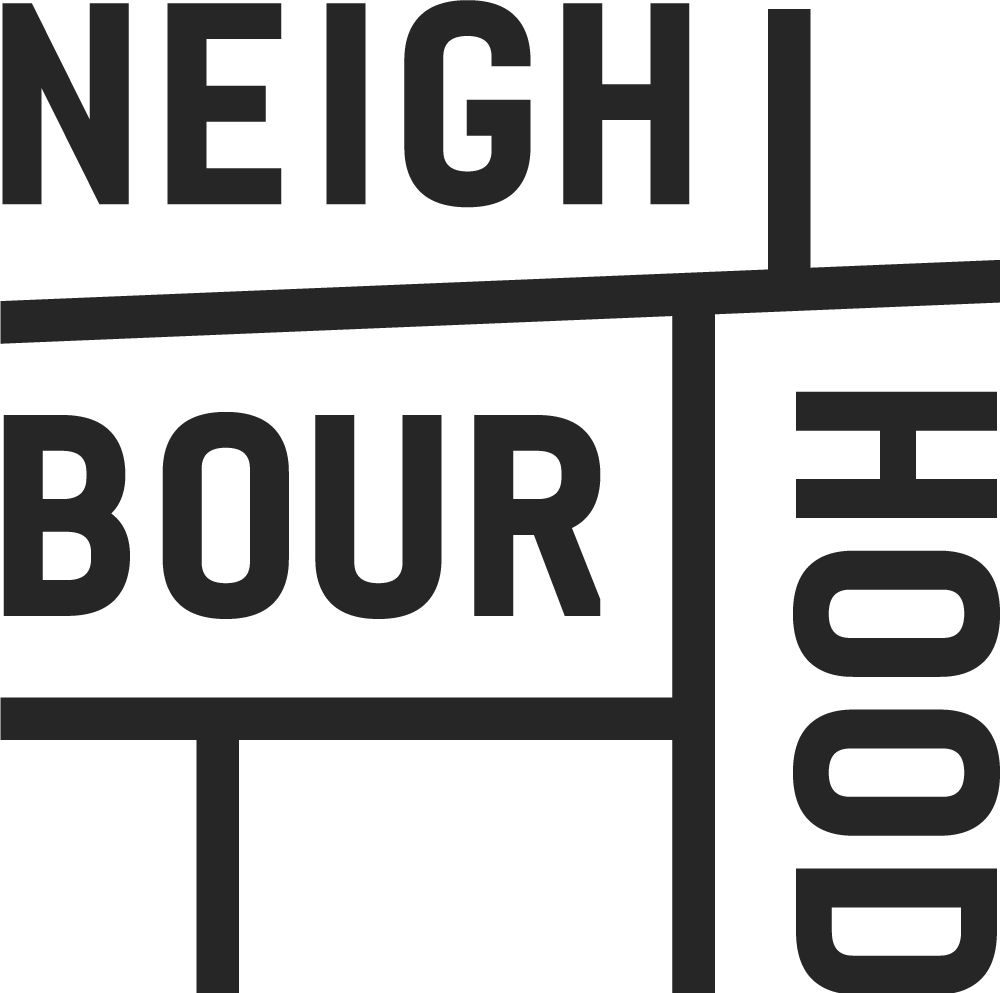
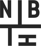
01 — Logo
The marks
Three lockups, one identity. Use the stacked mark by default; the inline lockup where width is tight (headers, footers); the brand mark only at small sizes or as an avatar / favicon. Reverse to white on dark, brand colour or busy backgrounds.
On light & dark
Ink lockups on cream or paper. White lockups on charcoal, on the coral accent, or over photography.
Clear space & minimum size
Keep clear space of at least one mark-module on every side (the dashed box). Don't render the brand mark below 24px, or the inline lockup below 120px wide.
Do & don't
02 — Colour
Surfaces & ink
Warm ivory ground, near-black ink, soft secondary text. Pure black and pure white are never used. In dark mode these flip to a warm charcoal via the surface aliases.
Interactive accent
Coral drives buttons, links and active states. The deep red is reserved for rare high-emphasis only.
Service-category palette
Each service owns a colour and a light tint. Solid colour for pills and accents; tint for section blocks and card grounds.
03 — Typography
Inter 24pt
One family, five weights. Hierarchy from size and weight, not extra typefaces. Heading roles carry their own clamp + tracking — use the .text-hero / .h-section roles, not raw sizes.
04 — Spacing
4-point scale
Semantic names, not pixel names. Use gap for sibling spacing; the .stack-* utilities for flow rhythm.
05 — Radius & elevation
Rounded & soft
Generous radii: pill buttons, 16px cards, 50px image masks. Shadows are warm-tinted and subtle (deeper on dark).
06 — Voice & brand
How we sound
The brand is what it looks like and what it sounds like. Full detail lives in BRAND.md (the single source of truth). The essentials:
Essence & personality
Super Human — bringing humanity to the spaces it's been forgotten. 90% nerd, 10% rebel.
Calibration: "Smart enough for the CTO, human enough for the CMO, real enough that neither feels sold to." Consistent across every channel.
Vocabulary
Patterns: short punchy sentences mixed with deeper ones. Sentence fragments for emphasis. Dry wit through parenthetical asides, never try-hard. No emojis in long-form (social is the exception).
Approved headlines
From the V4 deck. Confident, direct, short. Use as hero headlines, social titles, brief covers, posters.
Photography
07 — Components
The library
25 components, each shipping in React and vanilla from the same tokens. Demos below are the vanilla build; the React API mirrors it. See MANIFEST.md.
Loading components… (serve this folder if they don't appear)